Week 7 - Text and Box Styling
Text
CSS allows you a great deal of control over the appearance of text in your sites. The properties you use for this can be broken into two groups:
- The properties that change the font and its appearance (typeface, whether it is bold, the size, etc).
- The properties that are not font-dependent (color of text, spacing between words and letters, etc).
How you format your text has a significant impact on the readability of your site. We will discuss the CSS properties you can use to control how your text appearance, and how to use "best practices" to make your site as readable as it can be.
TYPEFACE TERMINOLOGY
SERIF - Serif fonts have small extra details on the ends of the mainstrokes of the letters. These are known as serifs.
SANS-SERIF - Sans-serif fonts have straight letter ends, and are cleaner than serif fonts.
MONOSPACE - All letters in a monospace font share the same width. (Letters are not all the same width in non-monospace fonts.
WEIGHT - Font weights are "light," "medium," "bold," etc. Font weight changes emphasis and also the amount of white space and contrast on a page.
STYLE - Font styles are "normal," "italic," "oblique," etc. Italic fonts have a cursive aspect, while oblique fonts are simply normal fonts placed at an angle.
STRETCH - Font stretches are "condensed," "regular," "extended," etc. In condensed fonts, letters are narrower and closer together. Expanded fonts are thicker and further apart.
CHOOSING A TYPEFACE FOR YOUR SITE
When choosing a typeface, it is very important to know that it will only display in the user's browser if it is available. What does that mean? Well, typically this means it has to be installed on the user's computer. However, you can also use web fonts and direct the user's browser to a site to locate said fonts.
So what happens if you specify a tyepface and it isn't installed on the user's computer (assuming you're not specifying a web font)? The browser simply reverts back to its default (which will depend on the browser and OS). It is possible for you to specify a font stack, which is a list of fonts, separated by commas, specifying an order of preference. For example, if you used font-family: Georgia, Times, serif; in your CSS, Georgia would be your first preference, followed by Times. If Georgia isn't available, then Times would be displayed. If that isn't available, then the browser's default serif font would be displayed.
WAYS TO SPECIFY FONTS
FONT-FAMILY - This is the most common method of specifying fonts in CSS (i.e. with a font-family declaration). This requires the font to be installed on the user's computer. When using font-family, you should always specify a font stack (like in the previous paragraph), so that you have at least one or two fallbacks. Another issue with font-family is the fact that most users have a limited number of fonts installed. (Not everyone is a typography fan.) A "pro" in the favor of this method, though, is the fact that you have no licensing issues to deal with. (You have it legally and so does the user - hopefully.)
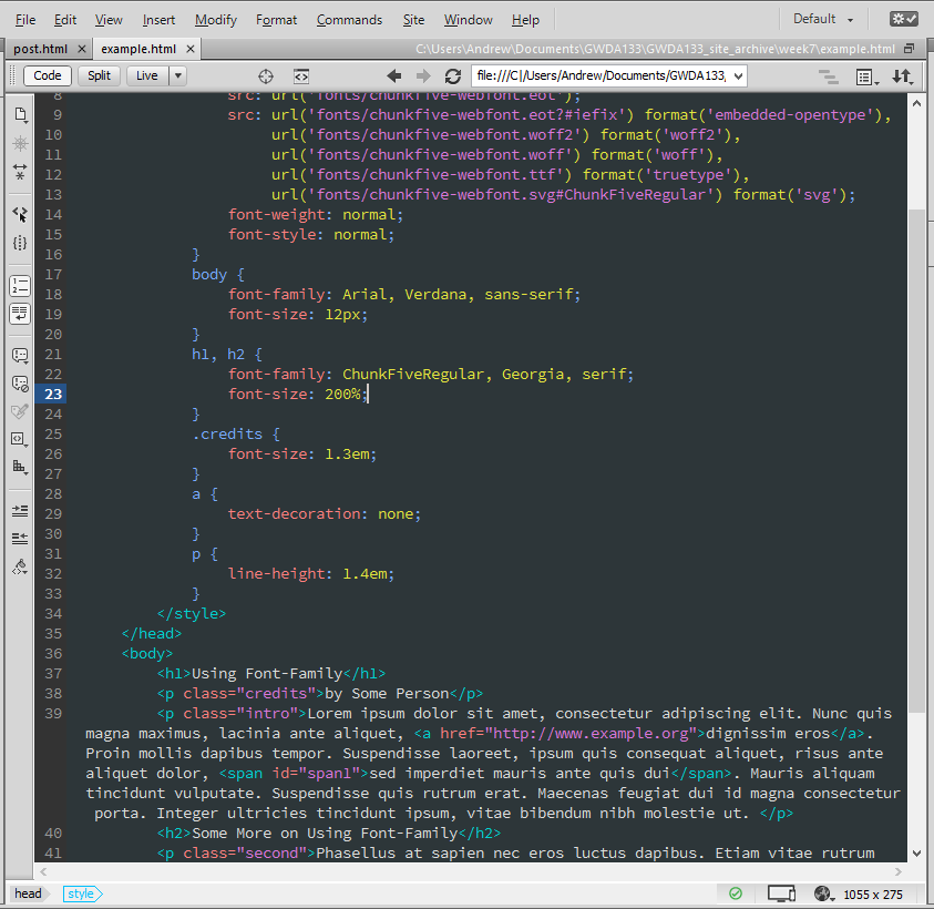
FONT-FACE - This is another way of specifying fonts in CSS. Unlike font-family, though, @font-face points the browser to a location where the font can be downloaded. Just as with font-family, there are pros and cons. One drawback of this method is the fact that the user has to download the font, which can slow the loading of a page and dampen the user experience. In addition, using @font-face requires that you have the license to distribute the font. There are many free-to-distribute fonts out there, but you should be very careful and ensure you are legally distributing a font when you use @font-face. There are services that will automatically block you from converting a font for web distribution if it is known that it cannot be done so legally (FontSquirrel, for example), but this doesn't catch all instances.
SERVICE-BASED FONT-FACE - There are many commercial services that will give you access to a wide range of fonts via @font-face. This might (and likely will) cost money in the form of recurring licensing fees, but the services take care of licensing issues so you don't have to.
OTHER - There are other methods, such as including text in images, SIFRS, and CUFON, but these will be discussed in the follow-on to this course (GWDA273).
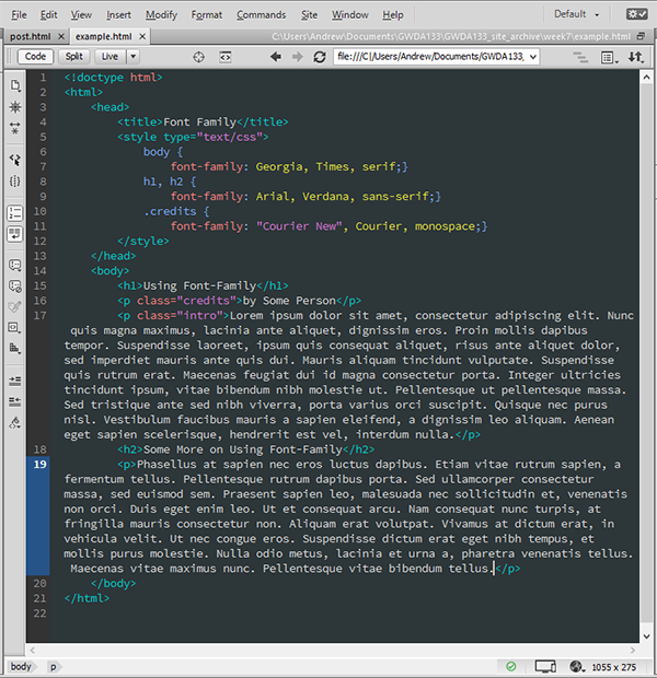
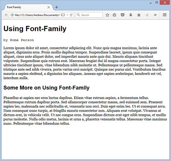
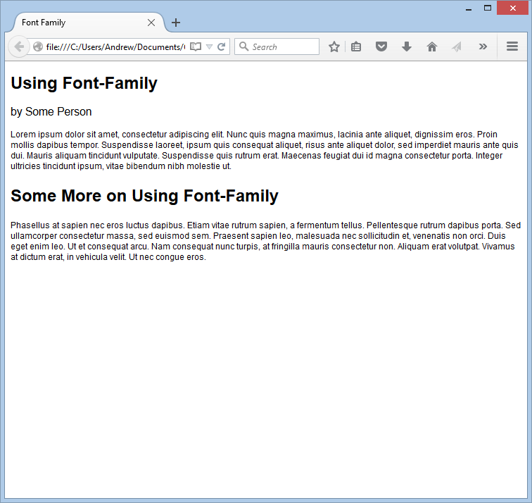
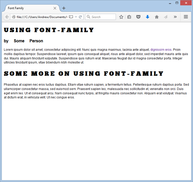
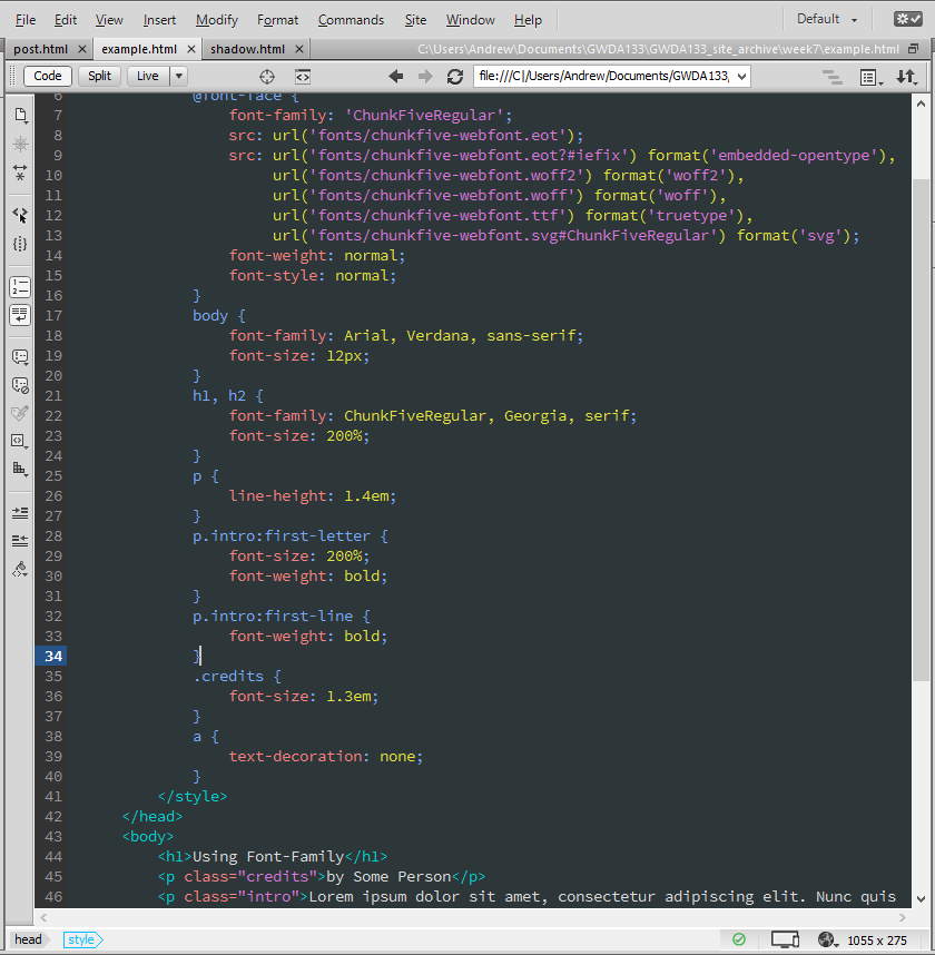
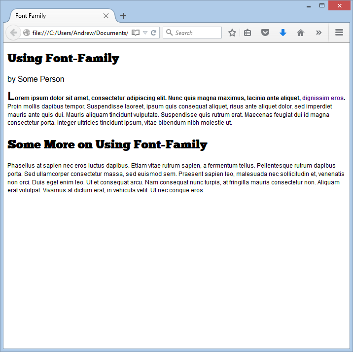
FONT-FAMILY
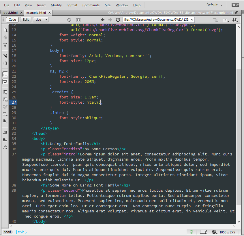
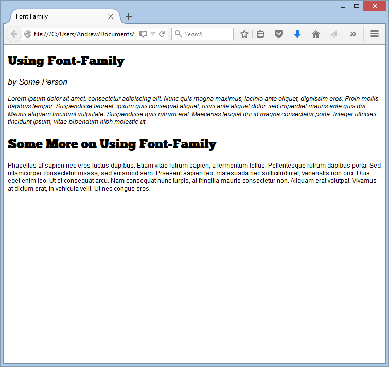
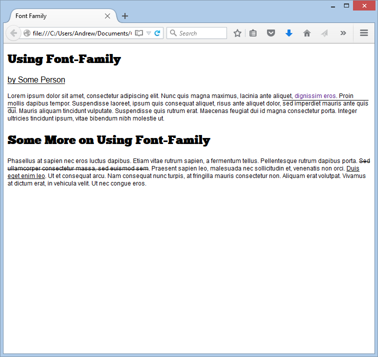
A best practice when using the font-family CSS property is to specify a font stack, to ensure the type of font you want used is seen by the user. In particular, you should end your font stack with a generic font name (like serif or sans-serif). If a font name is composed of more than one word, the words should be inside double quotes and separated by a space.
In the example below, I specify three types (a serif, a sans-serif, and a monospace) of fonts, and each font stack has three options. In addition, each stack ends in a generic name.
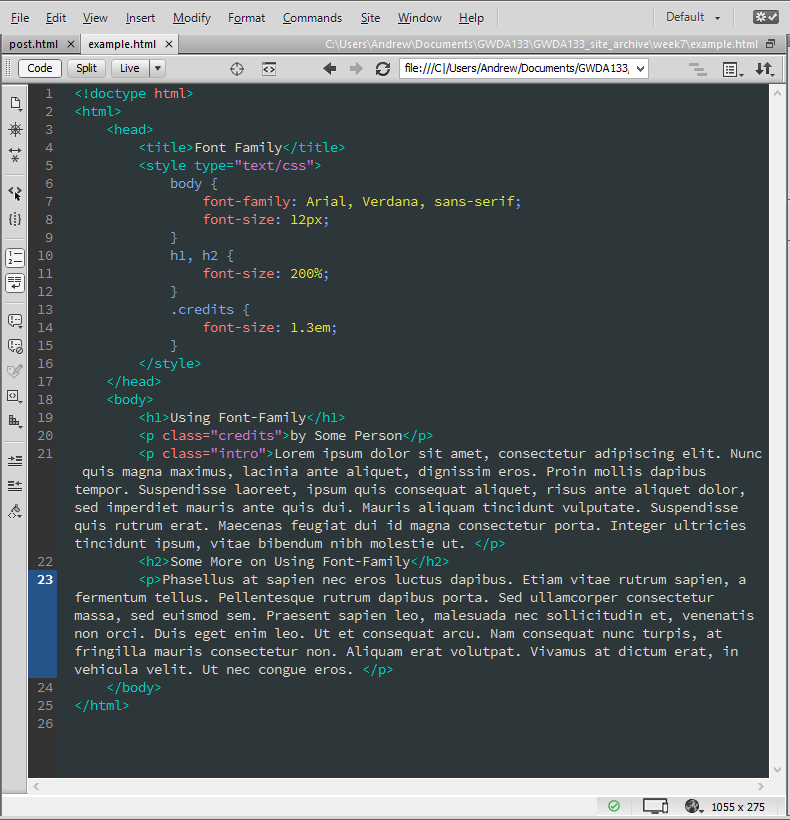
FONT-SIZE
The font-size property lets you specify how large a font will appear in your site. You can specify font sizes in pixels (giving the number of pixels, followed by the letters "px"), percentages (as percentages of the default font size of 16px, or as percentages of a font size you specify in advance), or ems (where an "em" is the width of the letter m in the typeface you specify, at the default size or at a default size you specify).
In the example below, I set the default body font size to 12px. I then set the heading font sizes to 200% of this (so they will be 24px), and the credits font size to 1.3em (which means an m in the credits will be 1.3x times the size of an m in the specified font family at the specified size).
TYPE SCALES AND UNITS OF TYPE SIZE
A pixel roughly equates to a point (which is the size unit displayed in applications like Word), because a point corresponds to 1/72 of an inch, and most computer displays have a resolution of 72 dpi. The default font size in almost every browser is 16px, which might seem strange coming from a text world where something like 12pt dominates. It is simply because 16px tends to make for a better reading experience in most settings. You get used to it.
PIXELS (px) - Setting font sizes in pixels always ensures the font appears at the size you intended (percentages will vary if the user has changed the default font size in his/her browser). Pixels are screen resolution relative, so your font will appear larger on a low res screen than on a high res screen.
PERCENTAGES - Font sizes set in percentages will vary according to the browser's default font size. Percentages are very useful when making responsive pages, but you should note the fact that 100% won't necessarily mean 16px (especially if you changed the default size in a body rule, for example).
EMs (em) - EMs let you set your font sizes relative to the size of the text in the parent element. In other words, if the font in a parent element - like a div - is, say, 24px, and you set the child element's font size to 0.75em, then the child's fonts will display at 18px. (At least an m in the child will...)
| PIXELS | PERCENTAGES | EMS |
|---|---|---|
| 12 PIXEL SCALE | ||
| h1 24px | h1 200% | h1 1.5em |
| h2 18px | h2 150% | h2 1.3em |
| h3 14px | h3 117% | h3 0.875em |
| p 12px | p 75% | p 0.75em (assuming body 100%) |
| 16 PIXEL SCALE | ||
| h1 32px | h1 200% | h1 2em |
| h2 24px | h2 150% | 1.5em |
| h3 18px | h3 112.5% | h3 1.125em |
| p 16px | p 100% | p 1em (assuming body 100%) |
USING @font-face
@font-face allows you to use a font, even if it isn't installed on the user's computer. The font is packaged with the website and downloaded by the user as he/she is downloading the page. Using this property requires you to specify a font-family (to specify which of the fonts is being used, such as a regular or light version) and a src (to specify where the font definition is located on your server). You can also give a format, which specifies the format the font is supplied in (more on that later).
In the example below, I downloaded the ChunkFive font from FontSquirrel in the "otf" format. I placed the otf file in the fonts directory, and included it using the @font-face and font-family calls.
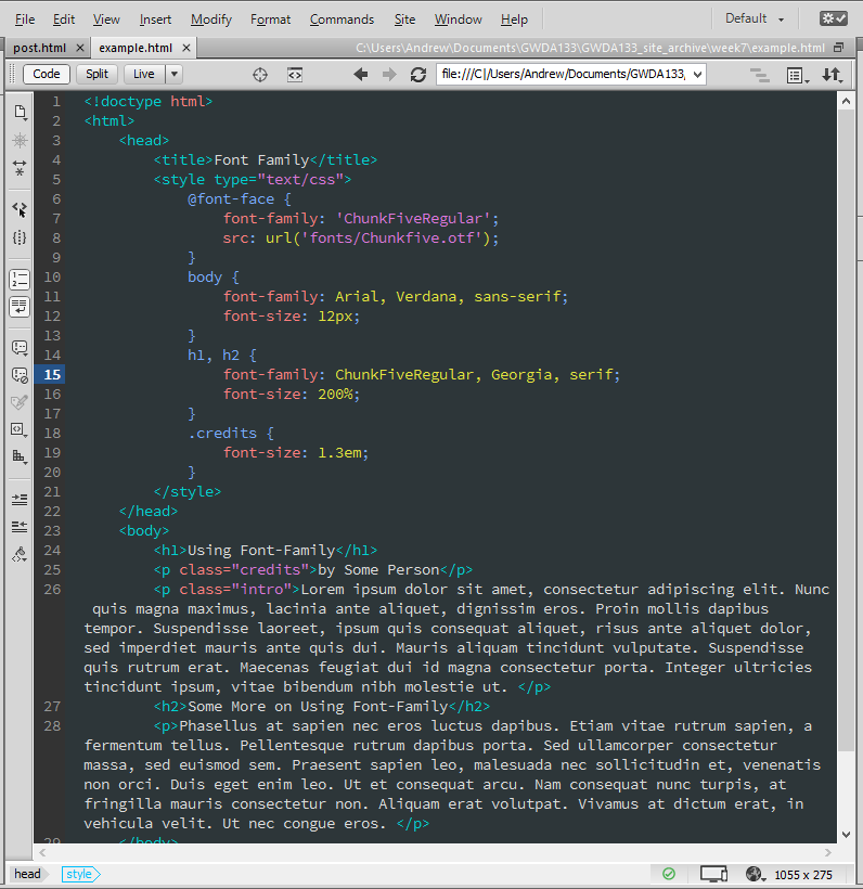

Many font makers will not allow you to use their fonts in this way, but the ChunkFive is an open source font that can be. You can find open source (and fee-based) fonts at sites like these:
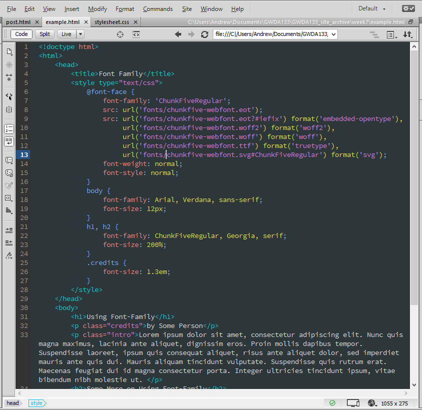
UNDERSTANDING FONT FORMATS
Browsers vary in what types of fonts they support (in much the same way as they vary in what types of videos and images they support). It is good practice to have eot, woff, ttf/otf, and svg copies of your fonts in your fonts directory, so as to maximize the likelihood of your font appearing as you wish it to. If you do not, you can upload your font to a site like FontSquirrel, and they will convert it for you. NOTE: Before you do this, be ABSOLUTELY SURE you have the right to distribute a font. You don't want to be on the receiving end of a lawsuit because you goofed up and distributed a font you shouldn't have.
| BROWSER | FORMAT | |||
|---|---|---|---|---|
| eot | woff | ttf/otf | svg | |
| Chrome (all) | no | no | no | yes |
| Chrome 6+ | no | yes | yes | yes |
| Firefox 3.5 | no | no | yes | no |
| Firefox 3.6+ | no | yes | yes | no |
| IE 5 - 8 | yes | no | no | no |
| IE 9+ | yes | yes | ttf yes/otf no | no |
| Opera 10+ | no | no | yes | yes |
| Safari 3.1+ | no | no | yes | yes |
| iOS < 4.2 | no | no | no | yes |
| iOS 4.2+ | no | no | yes | yes |
An example showing how to embed multiple types in your site:
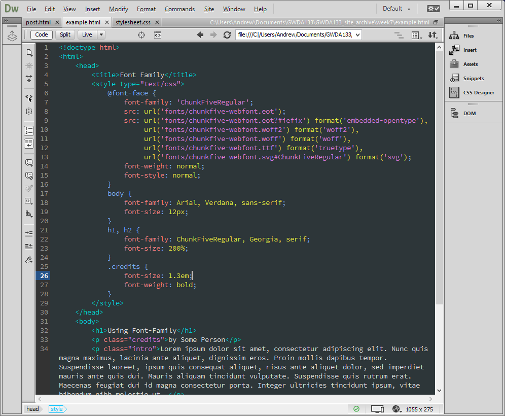
FONT WEIGHTS
You can use the font-weight property to create bold (or normal) text. (Why normal? Well, if you had a rule for the body that set all the fonts to bold, but wanted a particular element to show up normal, you would have to specify that.)

FONT STYLES
You can use the font-style property to set your fonts to appear as either normal, italic, or oblique. It is worth noting that browsers often cannot find an italic version of a specified font. In such cases, the browser will place the font on a slant. So, some (many?) italic fonts on the web are actually oblique!
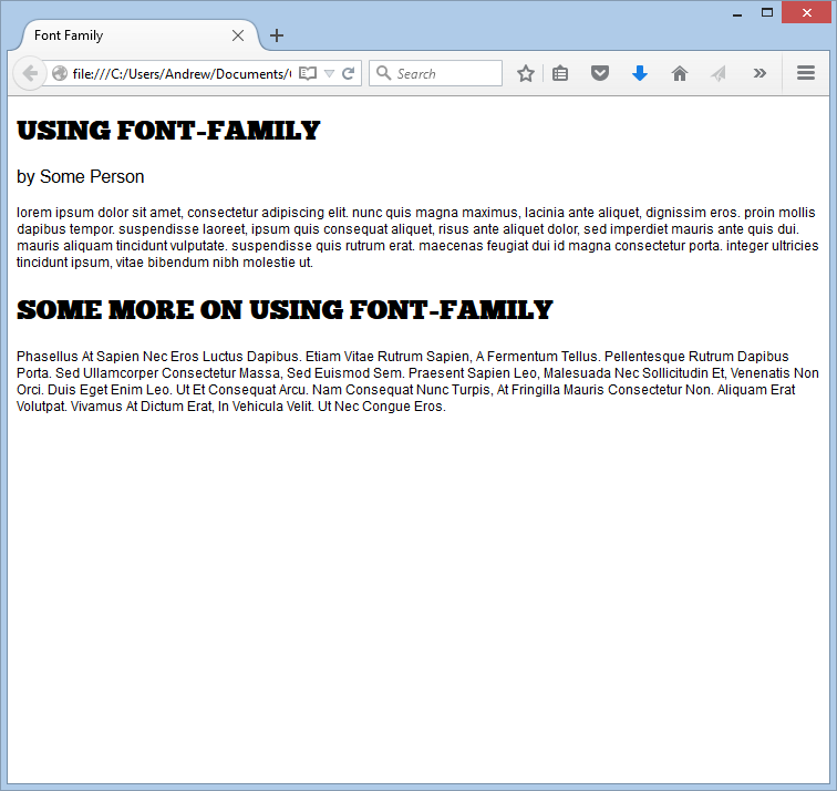
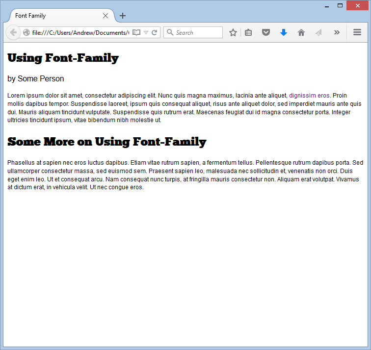
UPPERCASE & LOWERCASE (text-transform)
You can use the text-transform property to make a block of text all uppercase, all lowercase, or capitalized (first letter of each word is capitalized). When using the uppercase option, it often helps to change the letter spacing (via letter-spacing) to increase the gap between letters and, hence, readability.
In the example below, I set the headings to uppercase, the first paragraph to lowercase, and the second paragraph to capitalize.

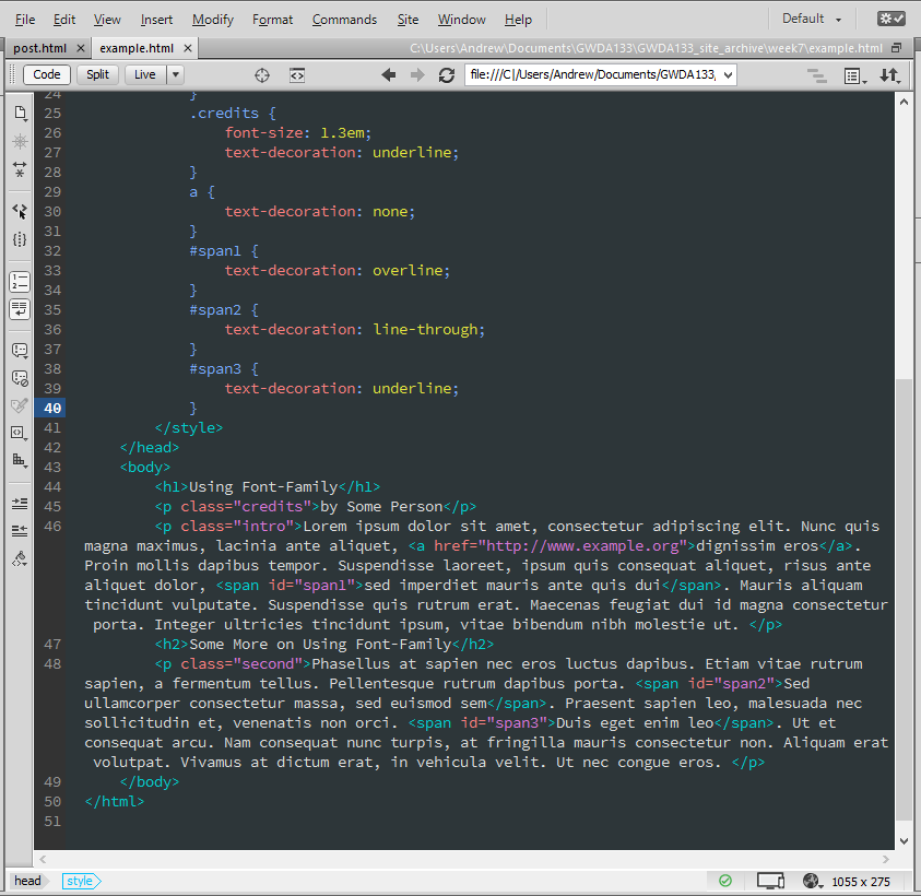
UNDERLINE & STRIKE-THROUGH (text-decoration)
You can use the text-decoration property to specify that a given block of text should have no decoration (value: none), or should be underlined (underline), overlined (overline), struck through (line-through) or blink (blink). (Blinking text should be avoided!)
In the example below, the credits are underlined, the text in span1 is overlined, the text in span2 is struck-through, and the text in span3 is underlined.
LEADING (line-height)
Leading (pronounced "ledding") is a typographical term for the amount of vertical space between lines of text. The text that drops below the baseline (such as the bottom of a lowercase p) is called the descender, and the highest part of a letter is called the ascender. Leading is measured from the descender on one line to the top of the ascender on the next line.
The line-height property sets the height of an entire line of text, so the difference between the font-size and the line-height is the leading. A larger line-height makes a larger vertical gap between neighboring lines of text. A good line-height for 16px text is around 1.3 to 1.5 ems. Dont' go too low, and don't go too high.
LETTER & WORD SPACING (letter-spacing, word-spacing)
You can increase or decrease the spacing between each letter in a block of text with the letter-spacing property. (Typographers call this quanitity - the space between letters - "kerning.") You can also increase or decrease the spacing between words in a block of text with the word-spacing property. You should use ems when specifying values for these properties. It can be good to increase the kerning in an all uppercase block of text, but changing word spacing is unusual.
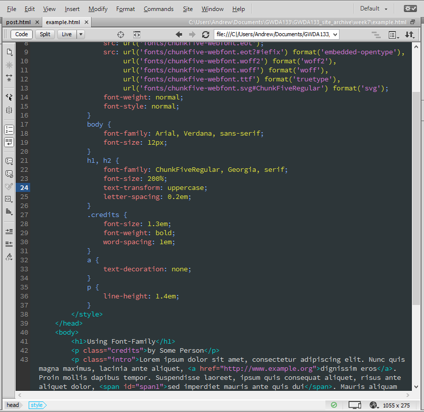
The default value for word-spacing is about 0.25em.
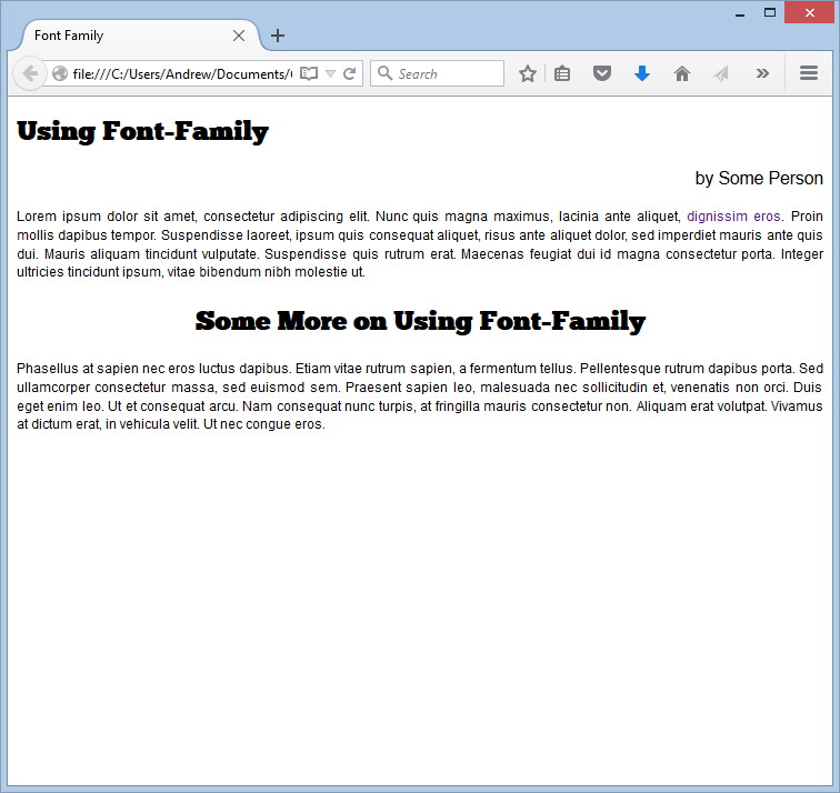
ALIGNMENT (text-align)
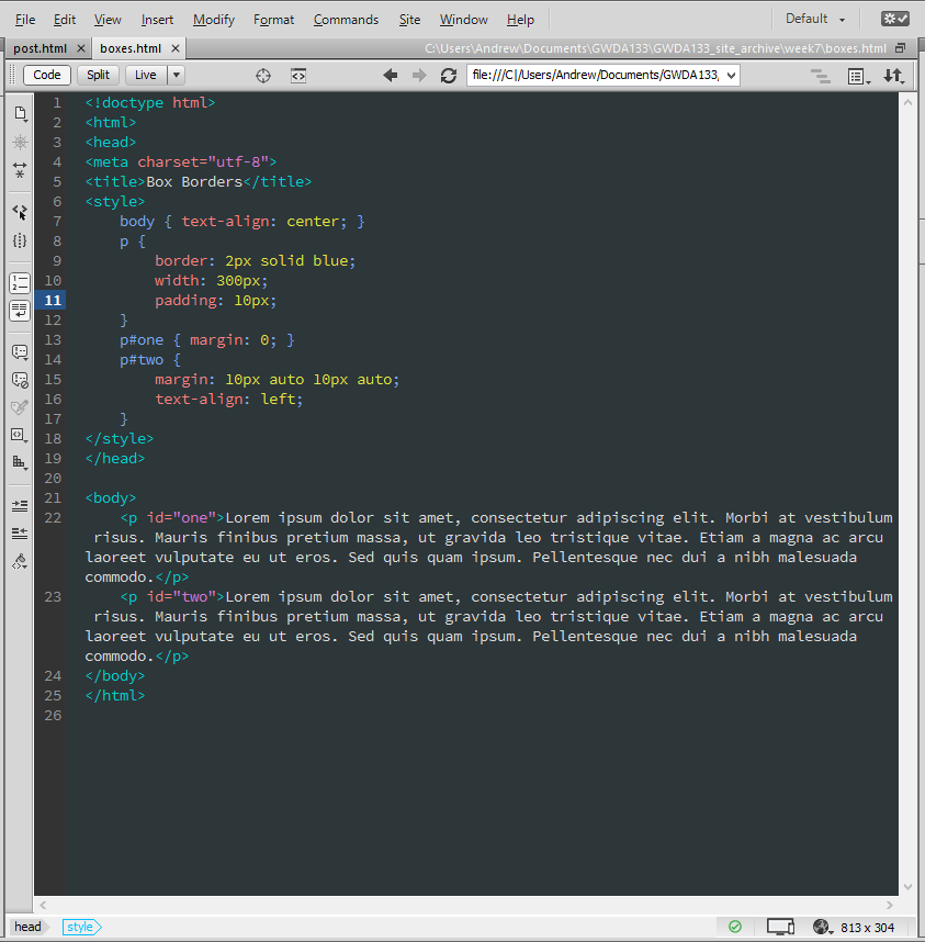
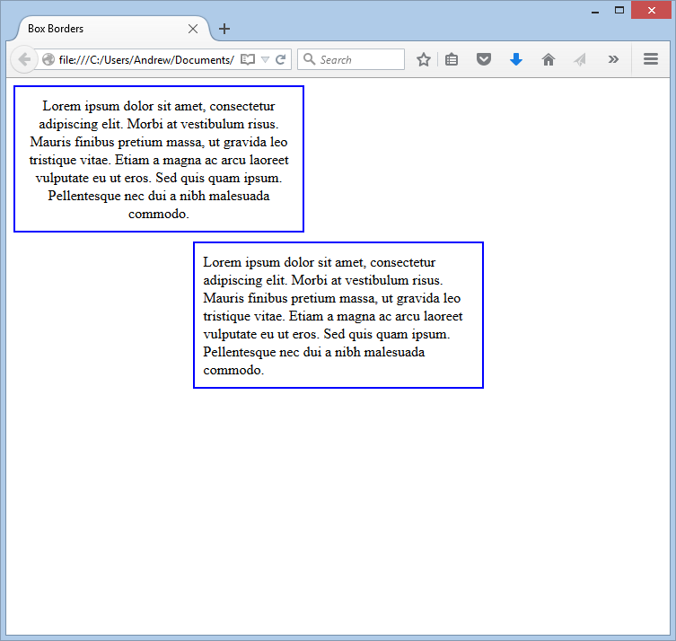
You can use the text-align property to control text alignment. Specifying a value of left indicates the text should be left-aligned. A value of right indicates the text should be right-aligned. A value of center indicates the text should be centered. Finally, a value of justify indicates that every line - except the last line - should take up the full width of the text's container. (If you have several paragraphs, left-aligned is considered easiest to read.)
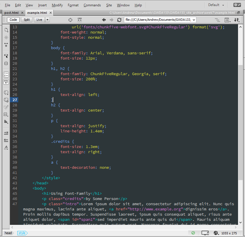
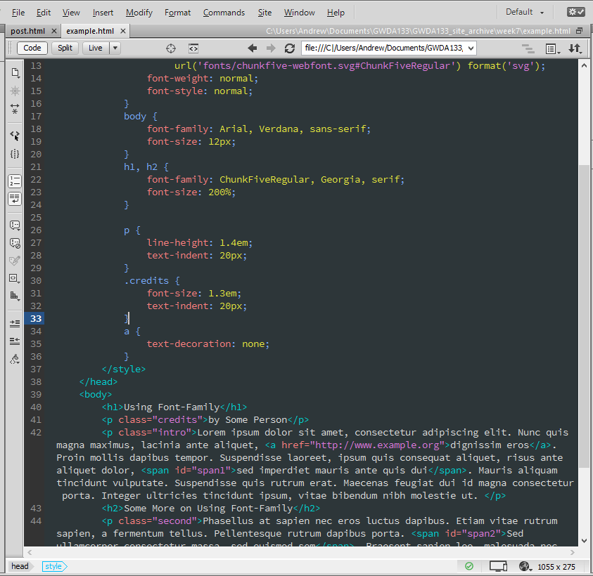
INDENTING TEXT (text-indent)
You can use the text-indent property to indent the first line of text within an element. It is also useful when we have images with text on them. Why? Well, we can include the text in the HTML, but give it a large, negative indent to move it off the page. Why do this? So that the text is still caught by search engines, and by text readers.

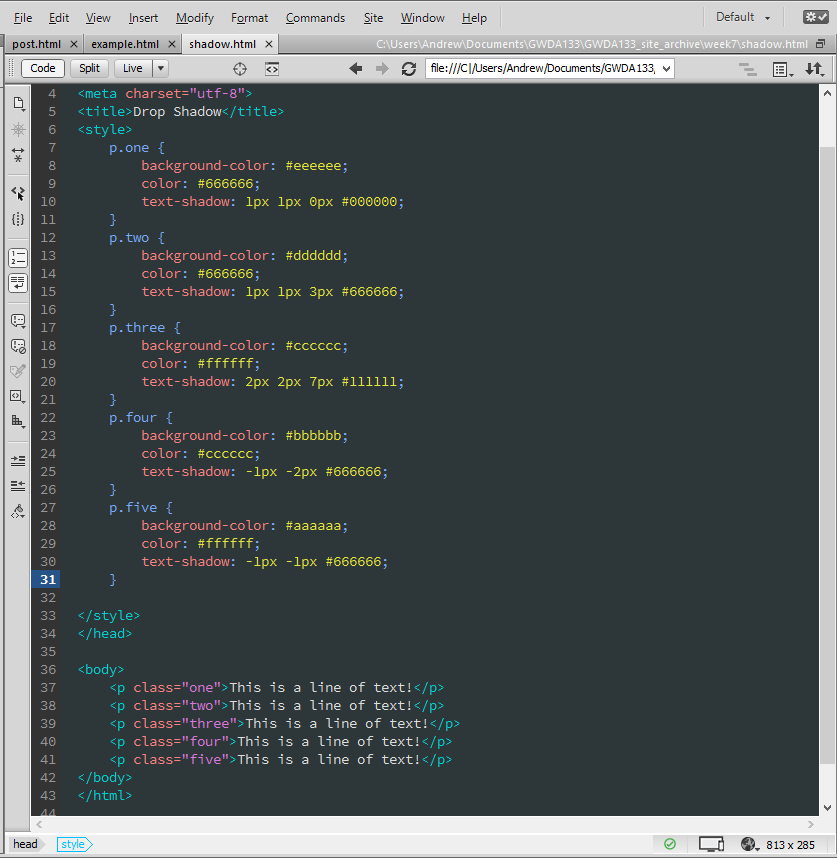
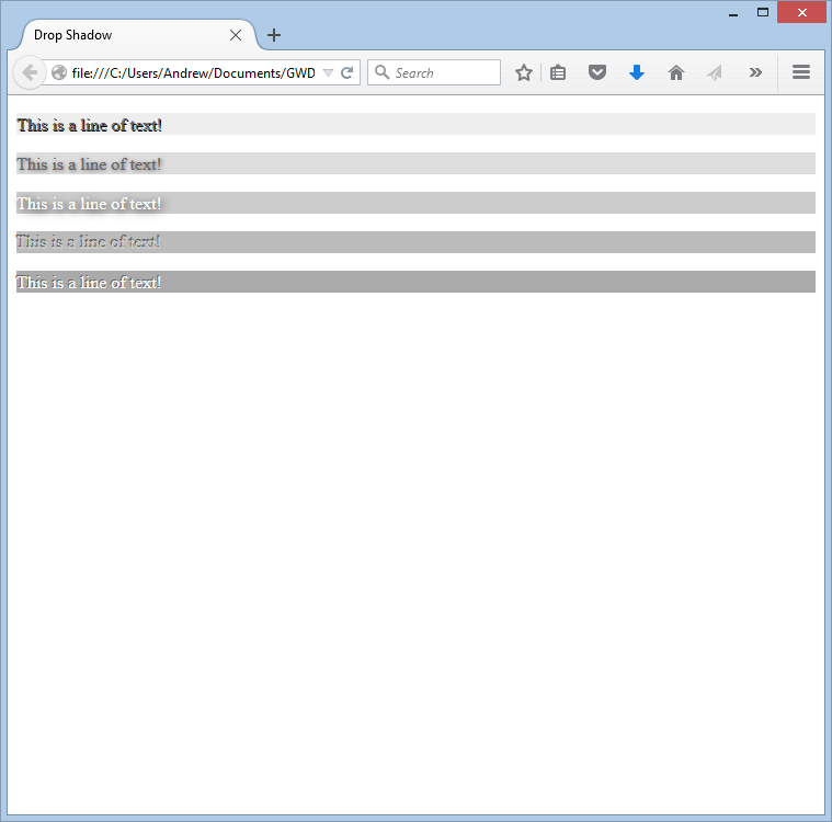
CSS3: DROP SHADOW (text-shadow)
You can use the text-shadow property to add a drop shadow to your text. The property can take three lengths and a color for the shadow. The first length indicates how far to the left or right the shadow should fall. The second value indicates the distance to the top or bottom that the shadow should fall. The third value is optional and specifies the amount of blur applied to the shadow. The fourth and final value is the color of the shadow. NOTE: This property is not compatible with all browsers, so be sure you have a fallback.
FIRST LETTER OR LINE (:first-letter, :first-line)
You can change the appearance of the first letter in a word or the first line of text in an element using the pseudo-elements :first-letter and :first-line. You specify the pseudo-element at the very end of the selector, without a space. (It is worth noting that whatever you specify for the first line will be displayed intelligently in the browser. By this I mean that you can resize the browser window, and the rule will be applied to whatever the current first line is.)
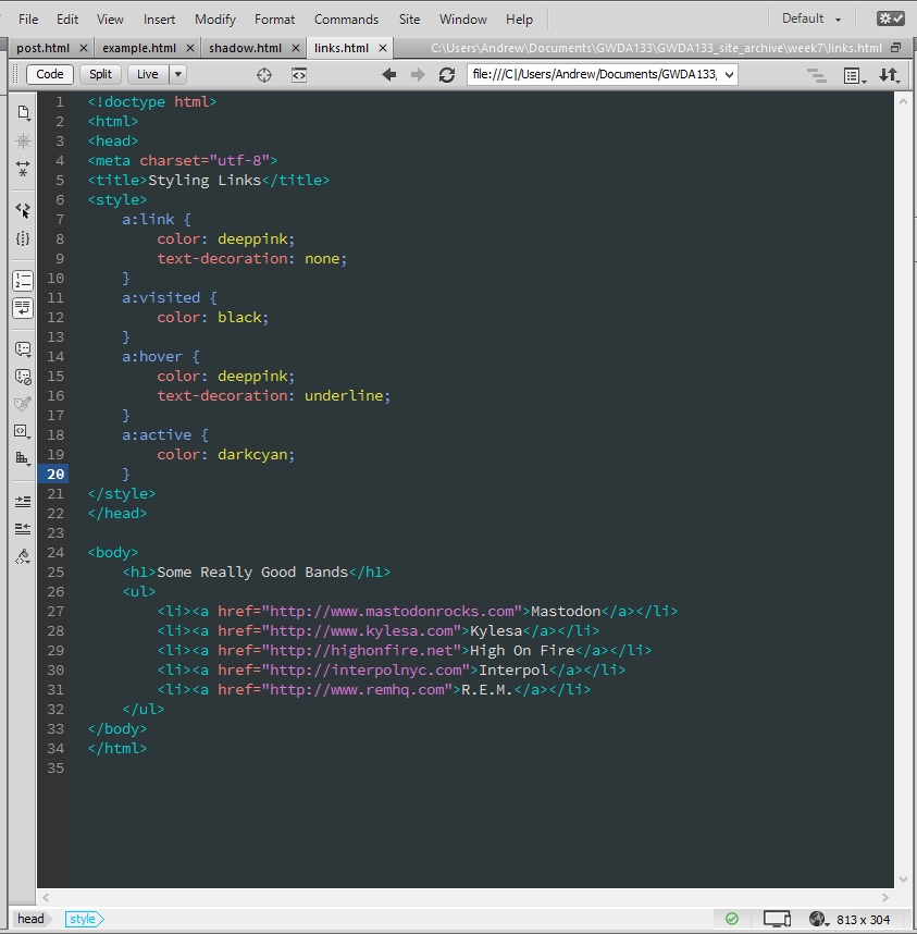
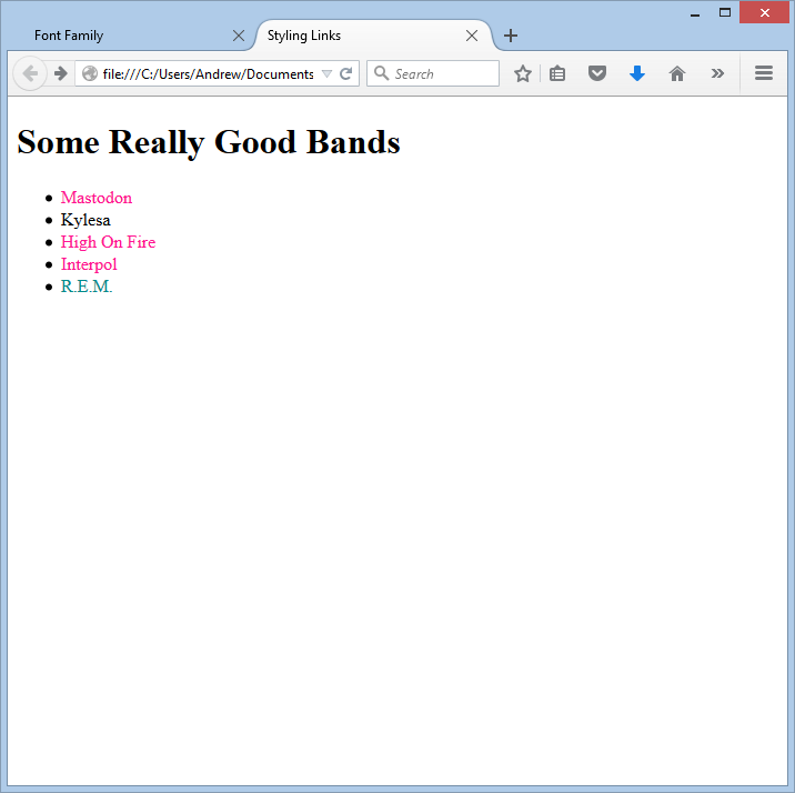
STYLING LINKS (:link, :visited, :hover, and :active)
There are two pseudo-classes in CSS that allow you to set different styles for links that have and have not yet been visited. You can style links that have not been visited using the :link pseudo-class, and you can style links that have been visited using the :visited pseudo-class.
In addition, there are two pseudo-classesthat you can use to change the style of a link when it is hovered over and when it is clicked (:hover and :active, respectively.) It is worth noting that :active and :hover can be used on any element. They are commonly used in forms. For example, :hover can be used to change the appearance of a button when you hover over it, and :active can be used to change the appearance of an a button when it is clicked.
BOXES
Recall how CSS views each element as sitting inside of an invisible box? Well, with CSS you can control how those boxes appear. You can:
- Control the dimensions
- Create borders
- Set margins and padding
- Show and hide
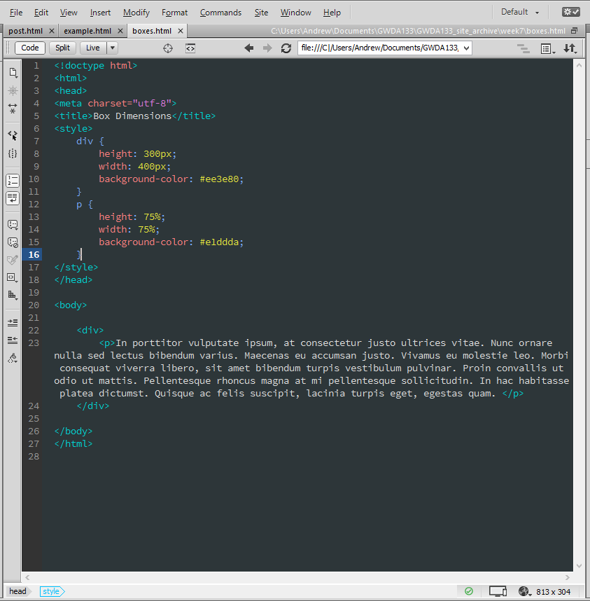
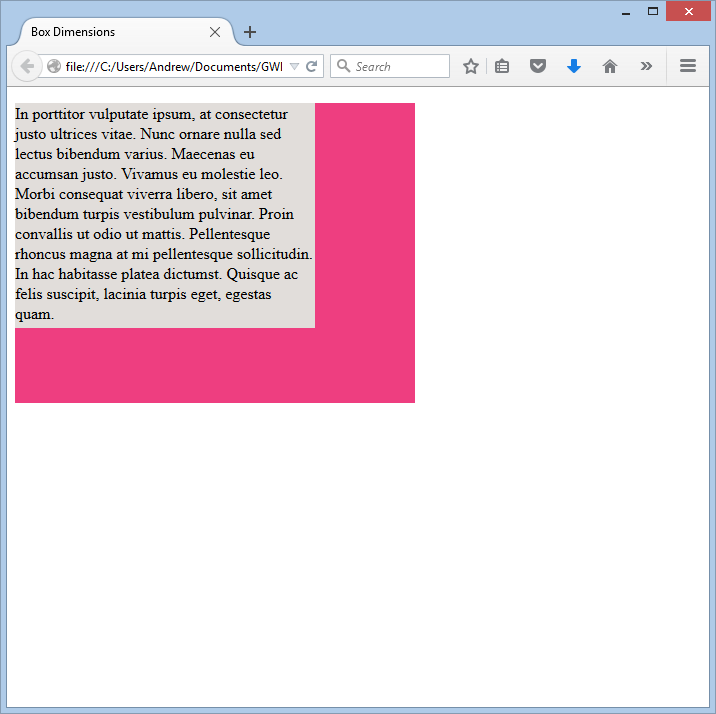
BOX DIMENSIONS (width and height)
You'll recall that a box defaults to a size just big enough to contain its contents (except for boxes around block elements, which will be just all enough, but will stretch the full width of the page). With the width and height properties, you can precisely control the dimensions of any box.
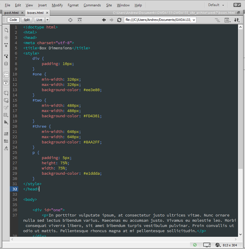
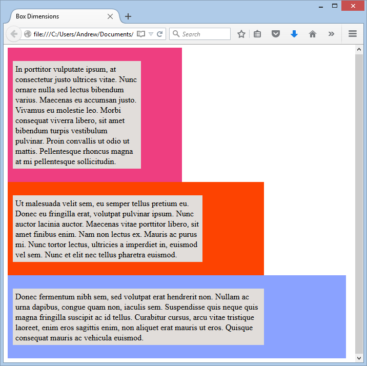
LIMITING WIDTH (min-width and max-width)
You can specify the minimum width of a box by setting the min-width property. This is particularly useful if you want to make sure the box stays a particular size after the browser window is shrunk past a certain point. Similarly, you can set the maximum width of a box by setting the max-width property. This is particularly useful when you need to stack a few boxes next to each other.
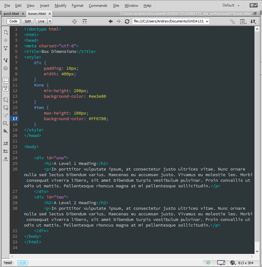
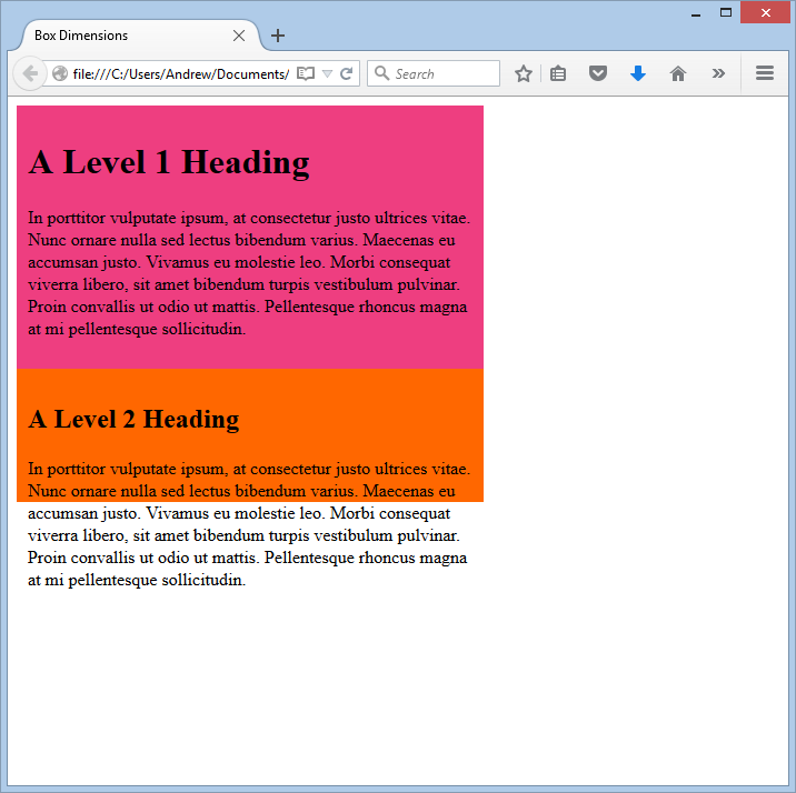
LIMITING HEIGHT (min-height and max-height)
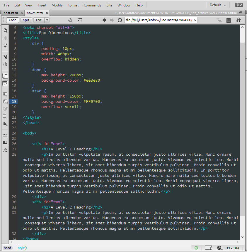
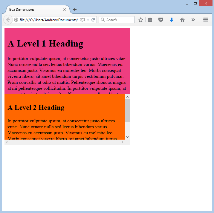
Just as you might want to limit the widths of boxes, you might want to limit their heights. You can do this with the min-height and max-height properties. The latter can be have some unexpected consequences if you don't think about the actual display height of the element to which you apply it. What do I mean? Well, you can easily have text over-run a box when you incorrectly apply the max-height property. For instance, note the second div in the example below. Of course, the best way to fix this would be to go back and change the max-height. However, there are cases (such as when you have text that is generated or fed in from another source) when this wouldn't work. You can use the overflow property to address these, as we shall see in a bit.
DEALING WITH OVERFLOWING CONTENT (overflow)
What do you do if content contained within a box is larger than the box itself? Barring being able to go back and resize the box, you can do one of two things in CSS: hide the content that doesn't fit (hidden), or apply a scroll bar (scroll) so that the user can scroll and see all the overflowed content.
The overflow property is very useful because some browsers let users change the size of the text to appear large or small. If the text is set very large, your text might overflow its container(s). Setting the overflow value to hidden prevents items overlapping and causing a huge mess. (Hidden overflow is also useful when you want to array things horizontally, as we'll see in the follow-on course: GWDA273.)
BORDER, MARGIN, & PADDING
You can control the appearance of a box using the border, margin, and padding properties.
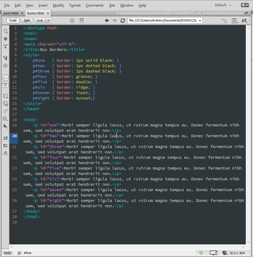
BORDER - Every box defaults to a 0-pixel border (i.e. it is invisible), but you can change this. You can give it a border of any width and any color you like. You can also specify whether it is solid, dashed, etc. Note: If you do give a box a border of any size (other than 0), it adds to the width and height of the box. (Width in the case of border, border-left, and border-right, and height in the case of border, border-top, and border-bottom.)
The border property takes three values: the first is the thickness (in px), the second is the type (solid, dashed, etc), and the third is the color.
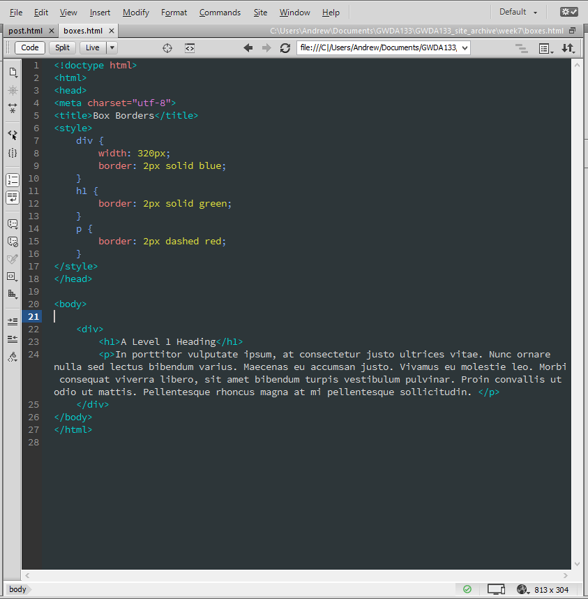
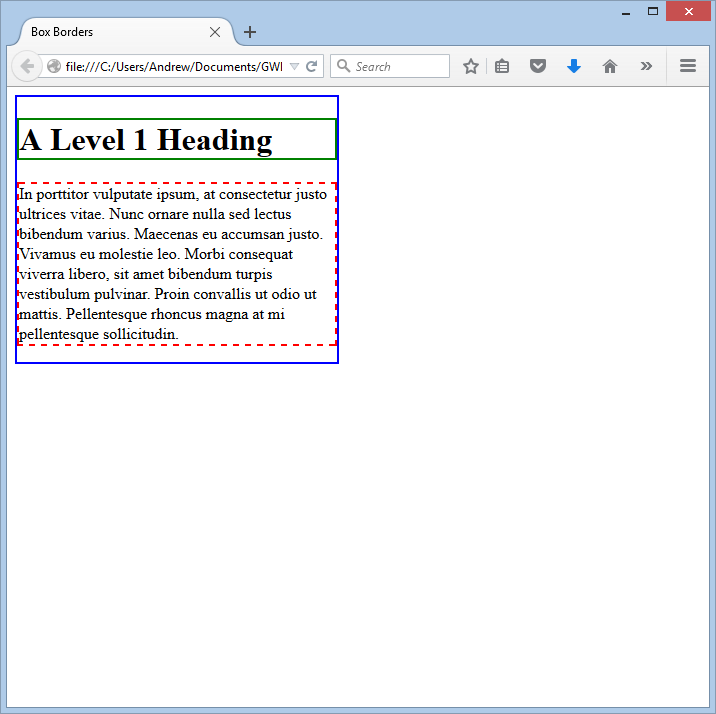
The above method is the "shorthand" (and preferred) method. You can also specify and modify borders using the border-width, border-style, and border-color properties, but the shorthand method is the most commonly used.
You can also apply single side borders using the border-left, border-right, border-top, and border-bottom properties.
Here is an example showing the various options for the style of a border. Note: The latter five have to be specified with single value arguments (just the type).
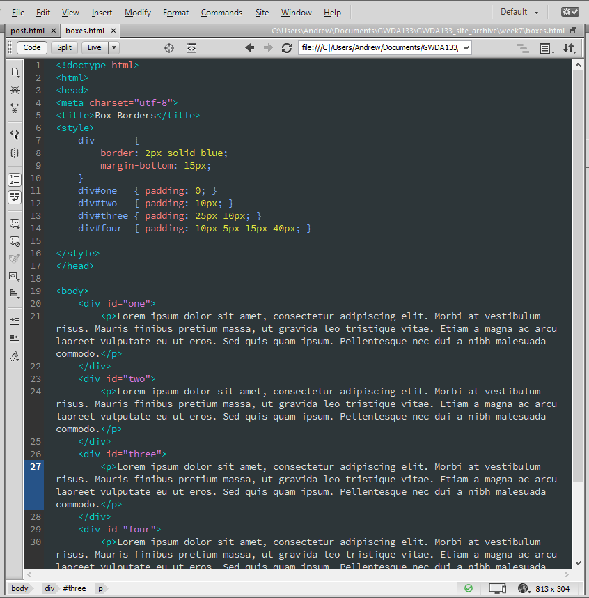
PADDING - The padding property lets you control how much space appears between the content of a box and its border. Padding is internal, so adding padding to, say, a div, will not separate that div from the things outside it. Rather, it will provide some separation in its interior. The padding property can take one, two, or four arguments. If you provide just one value, then that amount of padding is applied uniformly to all four sides of the box. If you provide two values, the first value is applied uniformly to the top and bottom of the box, and the second value is applied uniformly to the left and right of the box. If you provide four values, they are applied clockwise: top, right, bottom, left.
You can also specify very specific paddings using the padding-left, padding-right, padding-top, and padding-bottom properties.
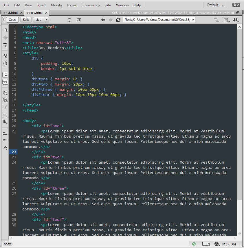
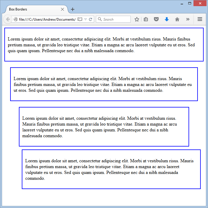
MARGIN - You can add (or subtract) space outside a box using the margin property. Like padding, it can take one, two, or four arguments. If you specify just one, a uniform margin is added outside the box (top, right, bottom, and left). If you specify two, the first value is applied above and below the box, and the second is applied to the left and right of the box. Finally, if you specify four, they are applied clockwise in this order: top, right, bottom, and left.
You can also specify particular margins using the margin-top, margin-right, margin-bottom, and margin-left properties.
The value(s) given to margin does not inherit, so if you want any children to have margins you need to specify them. Also, the values of border, padding and margin add to the dimensionf of the box. So, if you mean for a box to be precisely a certain width (or height), you have to factor in any border, padding, and margin values that might add to the width (or height).
CENTERING WITH MARGIN - You can use the margin property to center items within the page or within a box. If want the content centered horizontally and vertically, just use margin: auto. This is commonly applied to a div that contains all the content in a page, so as to center the content within the body (which results in centering the content within the browser window). If you want to center some content horizontally within its container, just set its left and right margins to auto.
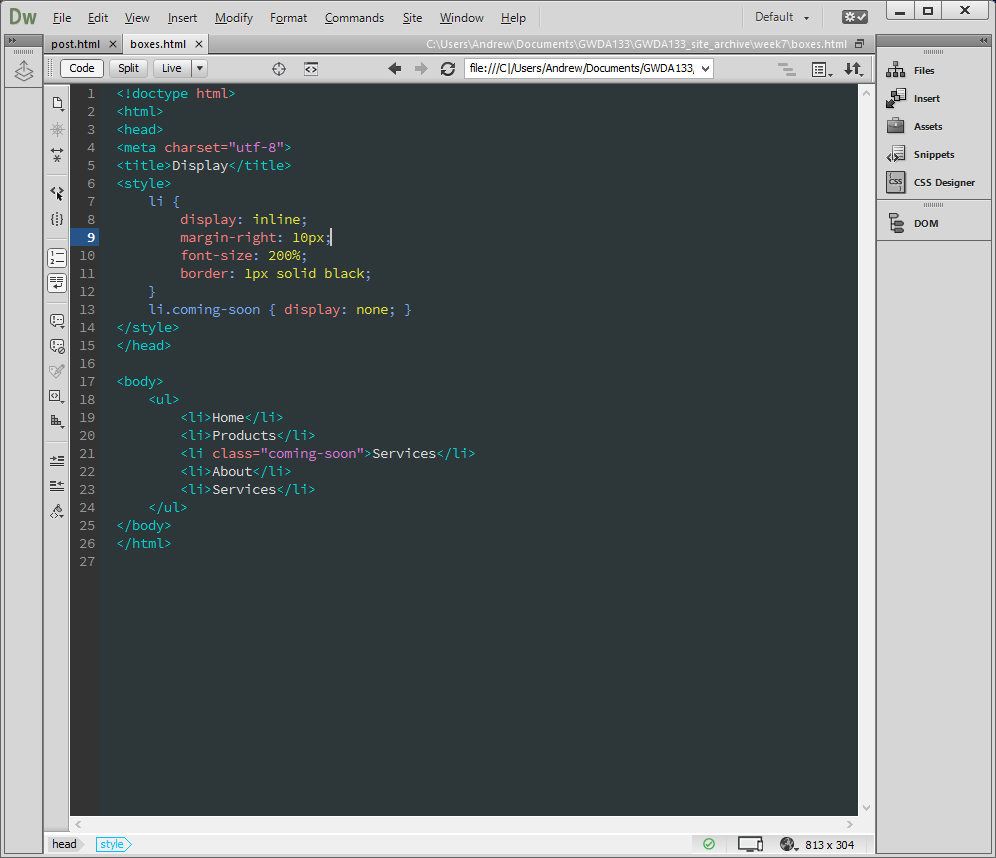
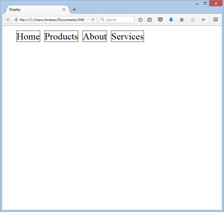
CHANGE INLINE/BLOCK (display)
The display property lets you turn an inline element into a block element, and vice versa. It can also be used to hide an element from a page. (Hiding an element is used in concert with JavaScript to make a page interactive. For instance, drop-down menus start off with the majority of their content hidden, but this content is then revealed when the user mouses over the top level button.) The display property can take four different values: inline causes an element to behave as if it is an inline element; block causes an element to behave as if it is a block element; inline-block causes a block level to flow like an inline element, but retaining the other features of a block element; and, finally, none hides an element.
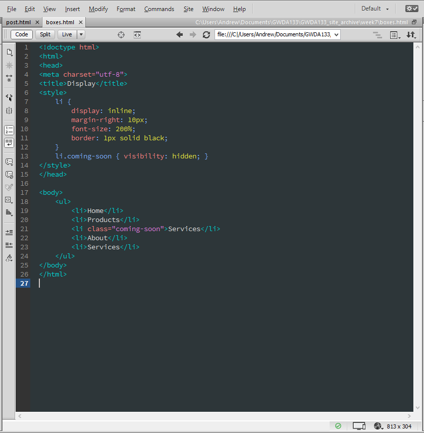
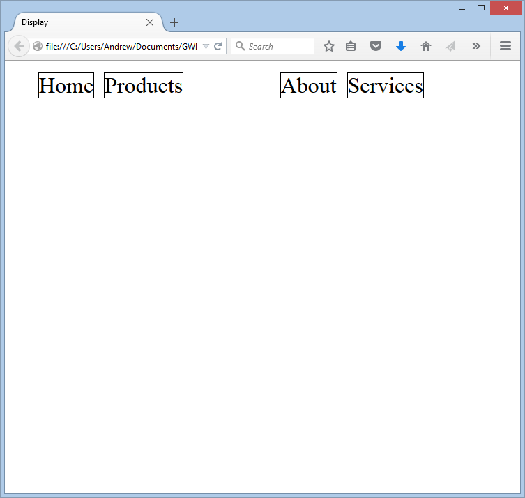
HIDING BOXES (visibility)
The visibility property lets you hide elements from users, but it leaves a blank space where the element would have been. It can take two values: hidden, which hides the element; or visible, which shows the element. NOTE: If you do not want an empty space, then just use the display property (with a value of none), as we did in the last example.
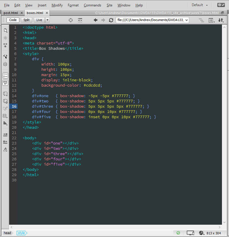
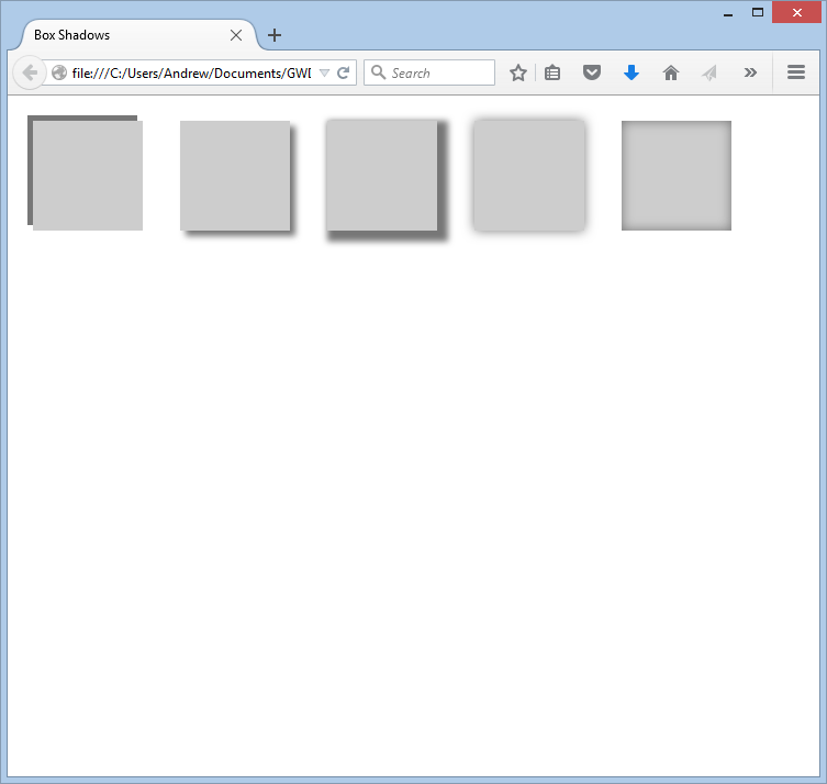
CSS3: BOX SHADOWS (box-shadow)
The box-shadow property lets you add a drop shadow around a box. It behaves exactly like the text-shadow property we talked about earlier. It can take up to five arguments, and requires at least two. The following are values you can pass to the box-shadow property:
- HORIZONTAL OFFSET - Positive values position the shadow to the right, while negative values position the shadow to the left.
- VERTICAL OFFSET - Positive values position the shadow below the box, while negative values position the shadow above the box.
- BLUR DISTANCE - This is optional. It creates a blur at the edges of the shadow, and is specified in pixels. If omitted, the shadow is solid like a border.
- SPREAD - This is optional. Positive values will cause the shadow to expand in all directions, and negative values causes the shadow to contract.
- In addition, the inset keyword can be added before these values to create an inner shadow.
It is important to note that box-shadow is becoming more and more widely supported, but it's smart to use three calls in your CSS to ensure compatibility: box-shadow, -moz-box-shadow, and -webkit-box-shadow.
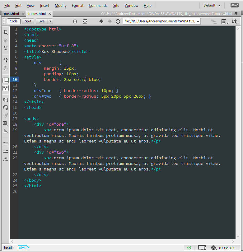
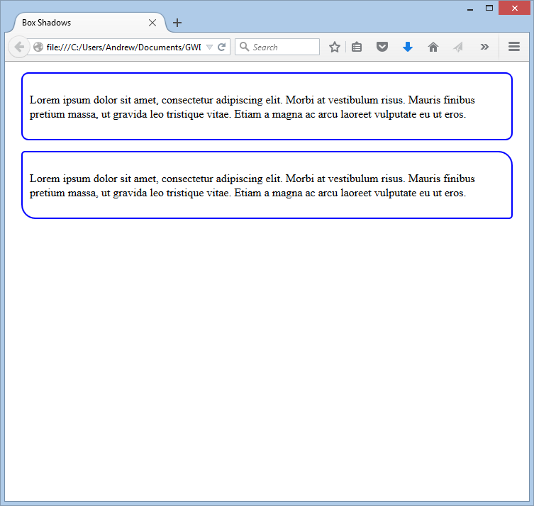
CSS3: ROUNDED CORNERS (border-radius)
With CSS3, you now have the ability to round the corners of a border on a box. You do this with the border-radius property. You can give it one or four values. If you specify one value, it is used as the border radius at all four corners of the box. If you specify four values, they are applied in clockwise order: top right, bottom right, bottom left, and top left. Also, you can specify individual corners using the border-top-right-radius, border-bottom-right-radius, border-bottom-left-radius, and border-top-left-radius.
Like the box-shadow property, it is a good practice to include three declarations in your CSS: one for border-radius, one for -moz-border-radius, and a third for -webkit-border-radius.
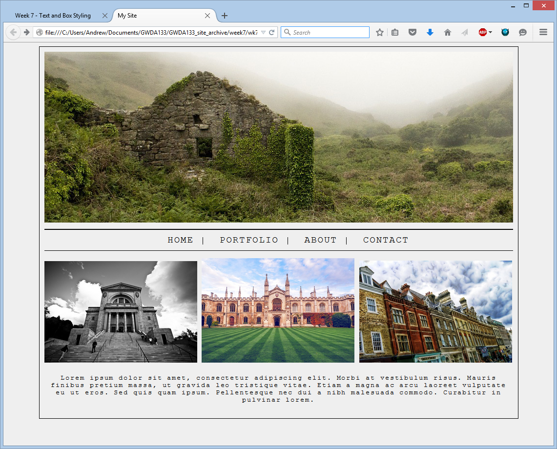
WEEK 7 HOMEWORK
Build a page that looks like the one below. The images don't have to match, but the MUST be free-to-use. I use Pixabay to find free-to-use images, so go ahead and use it for this assignment. (It's easy!) Your page needs to be centered, and the content needs to be 960px in width. Other than the images, your page should look identical to this page. I used "Courier New," but you're free to use any monospace font, provided you have the right to redistribute it. The navigation bar must have links, but they can be empty (href="#"). How you get everything to line up is up to you. There are many ways to get to the end point, so don't focus on any single "right" way. When you're finished, be sure to zip up your working directory - including images! - and submit to the appropriate dropbox.